For anyone interested in high resolution earthquake locations and focal mechanisms in southern California, I’ve updated my R-package yhs.catalog to include the latest update to the Yang, Haukkson, and Shearer (2012) catalog from the Southern California Earthquake Data Center.
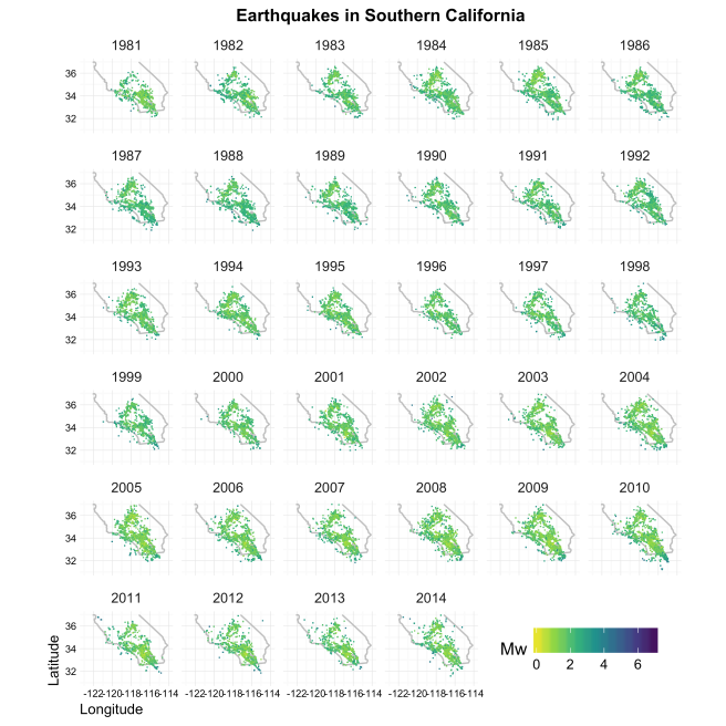
There are currently 196,993 earthquakes from 1981 through 2014 in the catalog:
Earthquakes in southern California since 1981. (Check out the github page in the link for code to reproduce this figure.)
Use devtools to install:
if (!require(devtools)) install.packages("devtools")

devtools::install_github("abarbour/yhs.catalog")
Power spectral density estimates of the Project MAGNET dataset from psd::pspectrum (lines), compared to those from stats::spectrum (points).
Greetings, Interweb!
I’m pleased to announce psd1.0, a long-overdue major update from the 0.* series which includes significant advancements in performance, improved clarity and consistency of documentation and method/class handling, and the elimination a few long-standing bugs.
Some major changes include:
Most importantly, all major bottlenecks have been eliminated with new c++ codes: the adaptive method is much faster now. Thanks to Dirk, Romain, and any other Rcpp (and RcppArmadillo) contributors for building such a fantastic package!
Unit testing: I’ve put in place the framework for unit-testing with testthat; so far there are only a few tests, but I’ll be adding more in the future. Thanks to Hadley and RStudio crew for yet another fantastic package!
Travis CI: automatic build-checking is done on each commit to the codebase. (How that system works so well is amazing.)
Dependency on fftw dropped: it’s been a frustrating process trying to ensure that the fftw dependency would be satisfied — my requests have generally fallen on deaf ears — so I dropped it; instead psd now uses good ole’stats::fft, despite the speed disadvantage for very long timeseries. I justify this by noting the dramatic speed increases afforded by the new c++ code, and that only a single DFT needs to be calculated during the adaptive procedure.
Loss of some backwards compatibility: unfortunately I’ve been unable to reconcile changes with the silly things I built into the original versions, so you may find that scripts written for 0.4.* fail — if this is a major issue feel free to get in touch with me and hopefully we can straighten things out.
Please submit Issues/Requests through github. And, as always, I’m happy to supply a reprint of the journal article accompanying the package.
When I was considering submitting my paper on psd to J. Stat. Soft. (JSS), I kept noticing that the time from “Submitted” to “Accepted” was nearly two years in many cases. I ultimately decided that was much too long of a review process, no matter what the impact factor might be (and in two years time, would I even care?). Tonight I had the sudden urge to put together a dataset of times to publication.
Fortunately the JSS website is structured such that it only took a few minutes playing with XML scraping (*shudder*) to write the (R) code to reproduce the full dataset. I then ran a changepoint (published in JSS!) analysis to see when shifts in mean time have occurred. Here are the results:
Top: The number of days for a paper to go from ‘Submitted’ to ‘Accepted’ as a function of the cumulative issue index (each paper is an “issue” in JSS). Middle: In log2(time), with lines for one month, one year, and two years. Bottom frame: changepoint analyses.
Pretty interesting stuff, but kind of depressing: the average time it takes to publish is about 1.5 years, with a standard deviation of 206 days. There are many cases where the paper review is <1 year, but those tend to be in the ‘past’ (prior to volume 45, issue 1).
Of course, these results largely reflect an increase in academic impact (JSS is becoming more impactful), which simultaneously increases the number of submissions for the editors to deal with. So, these data should be normalized by something. By what, exactly, I don’t know.
And, finally, I can’t imagine how the authors of the paper that went through a 1400+ day review process felt — or are they still feeling the sting?
Here’s my session info:
R version 3.1.0 (2014-04-10)
Platform: x86_64-apple-darwin13.1.0 (64-bit)

locale:
[1] en_US.UTF-8/en_US.UTF-8/en_US.UTF-8/C/en_US.UTF-8/en_US.UTF-8

attached base packages:
[1] stats graphics grDevices utils datasets methods base

other attached packages:
[1] changepoint_1.1.5 zoo_1.7-11 plyr_1.8.1 XML_3.98-1.1

loaded via a namespace (and not attached):
[1] grid_3.1.0 lattice_0.20-29 Rcpp_0.11.1 tools_3.1.0
And here's the R-code needed to reproduce the dataset and figure:
I really enjoy reading the Junk Charts blog. A recent post made me wonder how easy it would be to add summary curves for small-multiple type plots, assuming the “small multiples” to summarize were the X component of a ggplot2::facet_grid(Y ~ X) layer. In other words, how could I plot the same summary curve across each row of the faceted plot?
First we need some data. I have been working on a spectrum estimation tool with Robert Parker, and ran some benchmark tests of the core function against a function with similar functionality, namely spec.mtm in the multitaper package.
The benchmarking was done using the rbenchmark package. In short, I generate an auto-regressive simulation using arima.sim(list(order = c(1,1,0), ar = 0.9), n), and then benchmark the functions for incremental increases in n (the length of the simulated set); here is the resulting information as an R-data file. (I’m not showing the code used to produce the data, but if you’re curious I’ll happily provide it.)
With a bit of thought (and trial-and-effort for me), I found Hadley’s reshape2 and plyr packages made it straightforward to calculate the group statistics (note some prior steps are skipped for brevity, but the full code is linked at the end):
## reduce data.frame with melt
allbench.df.mlt <- reshape2::melt(allbench.df.drp, id.vars=c("test","num_terms"))

## calculate the summary information to be plotted:
## 'value' can be anything, but here we use meadian values from Hmisc::smean.cl.normal, which calculates confidence limits using a t-test
## 'summary' is not important for plotting -- it's just a name
tmpd <- plyr::ddply(allbench.df.mlt, .(variable, num_terms), summarise, summary="medians", value=mean_cl_normal(value)[1,1])

## create copies of 'tmpd' for each test, and map them to one data.frame
tests <- unique(allbench.df$test)
allmeds <- plyr::ldply(lapply(X=tests, FUN=function(x,df=tmpd){df$test <- x; return(df)}))
Here’s the final result, after adding a ggplot2::geom_line layer with the allmeds data frame to the faceted plot:
This type of visualization helps visually identify differences among subsets of data. Here, the lines help distinguish the benchmark information by method (facet columns). Of course the stability of benchmark data depends on the number replications, but here we can see the general shape of the user.self and elapsed times are consistent across the three methods, and that the rlpSpec methods consume less sys.self time with increasing series length. Most surprising to me is the convergence of relative times with increasing series length. When the number of terms is more than approximately 5000, the methods have roughly equal performance; below this threshold the spec.mtm method can be upwards of 2-3 times faster, which should not be too surprising given that it calls Fortran source code.
I assume there is a slick way to do this with ggplot2::stat_summary, but I was scratching my head trying to figure it out. Any insight into a better or easier way to do this is especially welcome!
Here is the code to produce the figure, as a gist. If you have any troubles accessing the data, please let me know.
Steps may be frequently found in geophysical datasets, specifically timeseries (e.g. GPS). A common approach to estimating the size of the offset is to assume (or estimate) what the statistical structure of the noise is and estimate the size and uncertainty of the step. In a series of posts I’m hoping to address a simple question which has no simple answer: Without any information about the location of a step, and the structure of the noise in a given dataset (containing only one step), what are some novel ways to estimate the size, uncertainty, and even location of the step?
Let’s first start with the control cases: A single offset of known size, located halfway through the series, in the presence of normally distributed noise of known standard deviation. A simple function to create this is here:
doseq <- function(heavi, n=2000, seqsd=1, seq.frac=0.5){
 # noise
 tmpseq <- rnorm(n, sd=seqsd)
 # + signal (scaled by stdev of noise)
 tmpseq[ceiling(seq.frac*n):n] <- tmpseq[ceiling(seq.frac*n):n] + heavi*seqsd
 return(tmpseq)
}
To come to some understanding about what may and may not be detected in the idealized case, we can use non-parametric sample-distance test on two samples: one for pre-step information, and the other for post-step. A function to do that is here:
 doit <- function(n=0, plotit=FALSE){
 xseq <- doseq(n)
 lx2 <- (length(xseq) %/% 2)
 # rank the series
 xseq.r <- rank(xseq[1:(2*lx2)])
 # normalize
 xseq.rn <- xseq.r/lx2
 df <- data.frame(rnk=xseq.rn[1:(2*lx2)])
 # set pre/post factors [means we know where H(t) is]
 df$loc <- "pre"
 df$loc[(lx2+1):(2*lx2)] <- "post"
 df$loc <- as.factor(df$loc)
 # plot rank by index
 if (plotit){plot(df$rnk, pch=as.numeric(df$loc))}
 # Wilcoxon rank test of pre-heaviside vs post-heaviside
 rnktest <- wilcox.test(rnk ~ loc, data=df, alternative = "two.sided", exact = FALSE, correct = FALSE, conf.int=TRUE, conf.level=.99)
 # coin has the same functions, but can do Monte Carlo conf.ints
 # require(coin)
 # coin::wilcox_test(rnk ~ loc, data=df, distribution="approximate",
 # conf.int=TRUE, conf.level=.99)
 # The expected W-statistic for the rank-sum and length of sample 1 (could also do samp. 2)
 myW <- sum(subset(df,loc="pre")$rnk*lx2) - lx2*(lx2+1)/2
 return(invisible(list(data=df, ranktest=rnktest, n=n, Wexpected=myW)))
}
So let’s run some tests, and make some figures, shall we? First, let’s look at how the ranked series depends on the signal-to-noise ratio; this gives us at least a visual sense of what’s being tested, namely that the there is no-difference between the two sets.
Indexed ranked series. From top-to-bottom, left-to-right, the signal-to-noise ratio is increased by increments of (standard deviation)/2, beginning with zero signal.
and makes clear a few things:
Very small signals are imperceptible to human vision (well, at least to mine).
As the signal grows, the ranked series forms two distinct sets, so a non-parametric test should yield sufficiently low values for the p statistic.
And, as expected, the ranking doesn’t inform about the magnitude of the offset; so we can detect that it exists, but can’t say how large it is.
But how well does a rank-sum test identify the signal? In other words, what are the test results as a function of signal-to-noise (SNR)?
   X<-seq(0,5,by=.1) # a finer resolution
   tmpld<<-sapply(X=X,FUN=function(x) doit(x,plotit=FALSE),simplify=T)
   # I wish I knew a more elegant solution, but setup a dummy function to extract the statistics
   tmpf <- function(nc){
      tmpd <- tmpld[2,nc]$ranktest
      W <- unlist(tmpld[4,nc]$Wexpected)
      w <- tmpd$statistic
      if (is.null(w)){w<-0}
      p<-tmpd$p.value
      if (is.null(p)){p<-1}
      return(data.frame(w=(as.numeric(w)/W), p=(as.numeric(p)/0.01)))
   }
   tmpd <- (t(sapply(X=1:length(X),FUN=tmpf,simplify=T)))
   ##
   library(reshape2)
   tmpldstat <- melt(data.frame(n=X, w=unlist(tmpd[,1]),p=unlist(tmpd[,2])), id.vars="n")
   # plot the results
   library(ggplot2)
   g <- ggplot(tmpldstat,aes(x=n,y=value, group=variable))
   g+ geom_step()+ geom_point(symbol="+")+ scale_x_continuous("Signal to noise ratio")+ scale_y_continuous("Normalized statistic")+ facet_grid(variable~., scales="free_y")+ theme_bw()
Which gives this figure:
Results of non-parametric rank-sum tests for differences between pre and post Heaviside signal onset, as a function of signal-to-noise ratio. Top: W statistic (also known as the U statistic) normalized by the expected value. Bottom: P-value normalized by the confidence limit tolerance (0.01).
and reveals a few other points:
If the signal is greater than 1/10 the size of the noise, the two sets can be categorized as statistically different 95 times out of 100. In other words, the null hypothesis that they are not different may be rejected.
The W-statistic is half the expected maximum value when the signal is equal in size to the noise, and stabilizes to ~0.66 by SNR=4; I’m not too familiar with the meaning of this statistic, but it might be indicating the strength of separation between the two sets which is visible in e Figure 1.
I’m quite amazed at how sensitive this type of test even for such small SNRs as I’ve given it, and this is an encouraging first step. No pun intended.
There seems to be a scale that’s tipping at the moment: Data or code that should be published* is often not. This should seem like an odd statement for anyone in science, but it should be easy to show that most publications (at least in the geophysics community) publish data in the form of a map, or a scatter plot, or in some other non-accessible way (besides visualization). Where is the spirit of reproducibility with such a practice?
Publications that do supplement their paper with data usually provide it in the form of a table in an ASCII flat file. And yes, this is what I’m arguing for, but I have come across some hideously formatted tables (the worst is when the table is in HTML or in a PDF) that nearly make me abandon all hope for the work.
So why am I writing this? Well, I’m preparing a paper for submission right now and thinking about how I want to publish the data (besides typeset tables or graphs), and I think I’ve come up with a solution for smaller datasets: An R package of datasets in CRAN.
What is CRAN? The Comprehensive R Archive Network. It’s a place for users of the R language to publish their code and/or data in a way that’s usable to the R community. Before the package (or an updated version of it) is accepted, it is checked for consistency; this means the only worry should be whether or not the code and/or data in the package is a pile of useless crap.
For the purposes of data publishing, we would need to consider a few things:
Identification. How will the user know what to access?
The package would need to be identified somehow, either by a topic, or a journal, or an author/working-group. I’d choose author since it assigns responsibility to him/her.
The dataset in the package will need to be associated with a published work – perhaps a Digital Object Identifier handle?
Format.
Obviously, once the data are in the package they will may be accessed in the R-language.
Databases such as flat files, for example, are not necessarily optimally normalized. So I propose publishing the data with as high a normalization as the author can stand. This will allow for robust subsetting of the data with, for example, sqldf (if SQL commands are your fancy).
Size: What happens when the dataset to be archived is very large? I propose the package author find a repository that will host the file, and then write a function which accesses the remote file.
Versions. I’m certainly no expert in version control, but there should be strict rules with this. 0.1-0 might be the first place to start which would mean: ‘zeroth version’.’one dataset’-‘no minor updates/fixes’
Functions. Internal functions should probably be avoided unless they are necessary, used to reproduce a calculation (and hence a dataset), or are needed for accessing large datasets [see (3)].
Methods and Classes.
The class should be something specific either to the package or dataset – I would argue for dataset (i.e. publication).
There should be at least the print, summary, and print.summary methods for the new class. If, as I propose in (A), the class is specific to the dataset, the methods could be easily customizable.
So I suppose this post has gone on long enough, but the argument seems sound given some fundamental considerations. Data should be published, and the R/CRAN package versioning system may provide just the right opportunity for doing so easily, reproducibly, and in a way which benefits many more than just the scientific community which has journal access. It would also force more people to learn R!
*I apologize if you’re not granted access this piece.
I have no problem generating focus, but there are some albums I listen to while I’m working that just seem to carry me along, weightless, rhythmic, and hyper-focused. According to my iTunes play counter, they are:
All Hour Cymbals, Yeasayer
Oracular Spectacular, MGMT
De-Loused in the Comatorium, the Mars Volta
Takk…, Sigur Rós
Security, Peter Gabriel
Two Conversations, the Appleseed Cast
Tao of the Dead, …And You Will Know Us By the Trail of Dead
Feels, Animal Collective
A Weekend in the City, Bloc Party
The Lamb Lies Down on Broadway, Genesis
I’m fortunate to work in an environment that doesn’t restrict things like music, but that just means I end up on Facebook or Google Reader more often than I should.
And there we have it, a simple example demonstrating the difference between a separator expression and a collapse expression without using a hideous loop.